How to create a graphical abstract using AI (Or not?)
- Chanelle Lai

- Apr 22
- 7 min read

How many times have you tried submitting a paper to a high profile journal, only to realise that you’re required to include a…
Wait for it…
“Graphical Abstract”?

Too many to count, right?!
Now you must be thinking…
“I’m a scientist, not a graphic designer!! “
So you try making one from scratch, but sometimes inspiration fails to strike…

Sometimes starting is the hardest step!
You try searching up template designs, but you have already seen three different graphical abstracts with the same design…

I'm bored already!
So you turn to the next thing, getting AI to make a graphical abstract for you (or if you’re a big fan of using AI for things, maybe this was step 1).
But does using AI to make a graphical abstract actually work? Does it hold up against the expectations for a typical graphical abstract? Can it produce something purposeful, accurate, journal-accepted and, well... actually good?
The other question to consider is of course which AI tools are best to use for crafting graphical abstracts? (So many to choose from!)
Well don’t worry, because we have tested them FOR YOU!
We’ve used the free versions of the AI tools mentioned below for this little experiment, because not everyone wants (or needs!) a paid subscription for these tools.
So it begins…
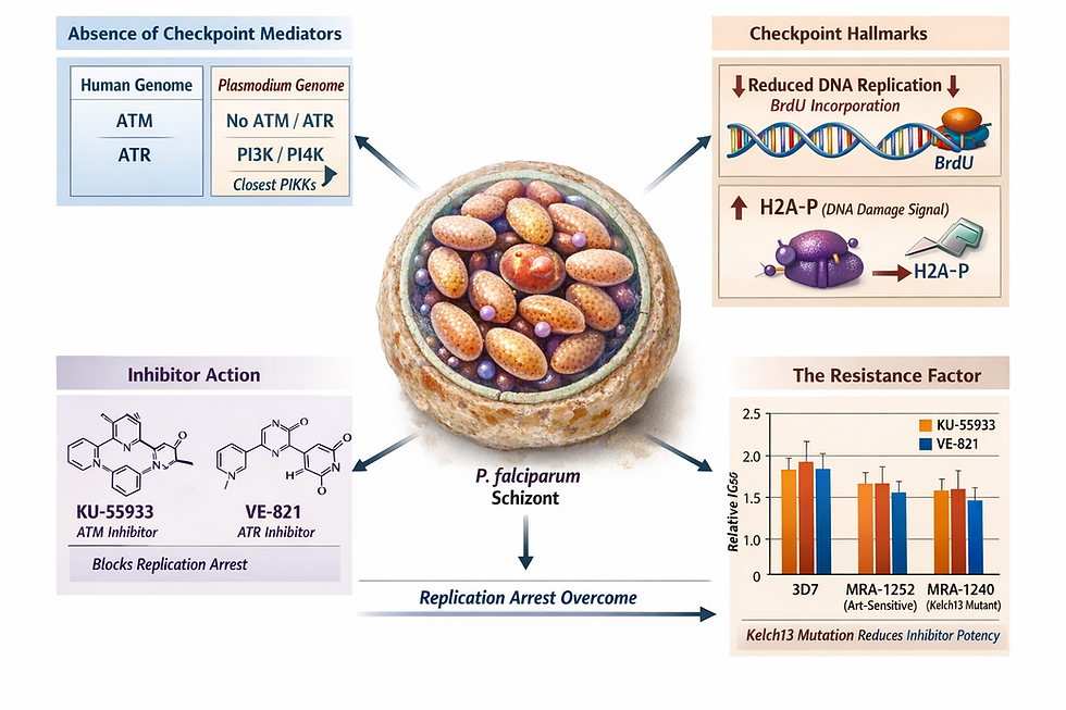
Let’s use the paper below as an example; something new and niche, just like what you’re working on!
Title: Cell cycle checkpoint activity in the malaria parasite Plasmodium falciparum
Here is a link to the full paper if you are interested.
I picked this preprint because I (Chanelle) had just read it for a journal club discussion.
Time to make a graphical abstract!

Step 1: NotebookLM
Here is where we introduce our first tool, NotebookLM by Google. It is designed specifically to act as your personalised research assistant. It excels at distilling key messaging from a dizzying amount of multiple sources (and can even create slide decks, infographics or podcasts from your sources!). What sets it apart from Large Language Models like ChatGPT, Claude or Gemini is that it only reads the documents you give it. So, it heavily reduces the risk for AI hallucinations. Since it can create infographics, it is a great first stop for getting a sense of what your own graphical abstract can look like (or shouldn't look like!).
Let’s add in our source material (your full paper in PDF) and see how it goes…

Here we go!!
BUT WAIT! Just adding one source and hitting GO might not work so well. For instance, this is what it ended up generating for our example paper:

It doesn't look half bad and is a good conceptual start, but on closer inspection it has plenty of irrelevant information and a ton of crazy graphics that are a far-cry from scientifically accurate and straight up WRONG.
How can we fix this mess?!?
Let us try adding some photos as reference for what the parasite should like, and then telling the tool what the summary (and key takeaway) of our paper is!
IMPORTANTLY: If you have read any of our previous blog posts on visual design, you would know that we value negative space on our graphical abstracts. That is why one of the subsequent prompts to the AI was to include 20-30% of negative space, which helps prevent the usual AI clutter.
Click here if you would like to read our previous post on creating a graphical abstract!
After adding some much-need context to our prompt, this is what we ended up with…

Slightly better, but there are still a LOT of critical information that it’s not getting right… 😞
Here is a list of subsequent instructions that we used to further tweak the prompt, including design-related guidance to steer the tool in the direction we want.Prompt list:
Don’t use tables in the infographic.
Use a uniform colour scheme with only 3 colours.
Make sure that all scientific names are properly italicised.
Make the text as concise as it can be.
This was the result:

Still far from perfect, but after the added instructions, it has certainly increased in visual appeal, focused clarity and layout simplicity. Accuracy of information still remains a big issue however…
Because Google’s Gemini is such a powerful image generator, we wondered whether using it, rather than NotebookLM alone, would make any difference to the results.
Step 2:Google Gemini image generation
We started with the written summary from NotebookLM and added plenty of extra context. Once we realised these AI tools still need a lot of guidance, we wrote a much more detailed prompt.
The instructions included:
The paper's summary.
Use 20-30% of negative space in the infographic.
Use more minimalistic and realistic art.
Infographic in landscape orientation.
Use title from the paper for the infographic.
No tables in the infographic.
Use a maximum of two to three colours for the infographic’s colour scheme.
Make sure that all scientific names are properly italicised.
Make the text as concise as it can be.
Ensure that the title of each subsection is intuitive to the reader.
And here were the results…

WOAH!! Talk about information overload!!! 😟

POV: You trying to read this graphical abstract
So as a quick-fix one-shot solution? Not the best tool (in our humble opinion), for generating graphics from new information.
After several attempts of trying to get Gemini to declutter the graphical abstract we ended up with this:

Still too much text, too much clutter, and too little rest-for-the-eyes space…
At this point, you might be thinking, “You’re just chucking full papers at random AI tools to generate these infographics. Of course they won’t be good”, or “ChatGPT can do so much better!”. But be patient. We’re on a journey.
Now, let’s see how some of the other biggest AI tools, powered by different underlying LLMs, compare!

Step 3: Comparison between Gemini, (ChatGPT and Microsoft Copilot)
For this comparison, we took no chances and created a much longer, more detailed prompt, which included….
Landscape layout
Negative space minimum 20-30%
Colour scheme
Font
Montserrat Bold/ Regular
Image provided as an example of layout for the graphical abstract (see below)
Never include more than 80 words in the graphical abstract.
Make sure all scientific names are properly italicised.
Use minimalistic and realistic art.

Gemini
To fairly compare the best that Gemini has to offer with its rivals, we wanted to use Gemini's customisable project-function (called "Gems"), where you can create a tailored 'Gem' with specific instructions Now, an important thing to note is that in Gemini, you can create what is essentially a canned template for your work, called a “ Gem”.
So instead of having to send the same prompt repeatedly for each new project, you could have something like this:

Creating a “Gem” with embedded instructions for your graphical abstracts.
Using the Gem we made, the graphical abstract generated looked something like this:

Looks pretty much like a standard graphical abstract, but that is still not what we are looking for. We want excellence!
Because we wanted the graphical abstract to feel closer to our templates in terms of layout, we asked it to rearrange the information to more closely match one of the reference graphic provided in the Gem and…

Why is there a cyclist?!?

And now here is another important lesson…
Be very VERY specific with your prompts, because when we asked Gemini to replace the cyclist with a photo of the parasite, this happened:

And when we asked Gemini to remove the cyclist entirely:

Well, can’t say it didn’t do what we asked it to.

A lot of back and forth later and we were eventually hit with an image creation limit, leaving us with this:

Not the worst one, but definitely nowhere near our expectations.
Chat GPT
One of the more commercialised AI LLMs that has changed the way we view AI forever, this is the one AI tool most people would expect to do well. You’ll see pretty soon, though, that this is not the case at all.
Using the same prompts as for Gemini, this is what it generated:

…Yeah.
Hardly believable, plus this is the kind of image you would imagine when you think “AI generated”.
We gave it the same cyclist poster as a design template, and asked for it to be more minimalistic and scientifically acceptable. We also asked it to remove the petri dish image.
This is what it ended up with:

Chat GPT has in fact, removed the petri dish. Also, apparently now it is unable to spell…
Can’t believe I’m saying this, but maybe the image creation should be left to the scientist… (Or the scientific illustrator! 😉)

And finally…
Microsoft Copilot
Most people have it, nobody uses it. But maybe you should? 😃
We gave it the same prompts from before, and this is what it came up with:
Probably the cleanest design we’ve got back in the first go AND hey, it can spell!
The image certainly leaves much to be desired, but let’s see if it can be fixed with a few more instructional prompts…

Still not great, but less bad!
In summary:
So, what did we actually learn from this whole adventure?
1. Start with a strong concept
Use NotebookLM to distil the key message from your paper before touching any image tool. Going in without a clear visual brief is like asking someone to draw your research from a vibe. Spoiler: it doesn't go well.
2. Be obsessively specific with your prompt
The cyclist did not appear by accident. If you don't spell out every detail, the AI will fill in the gaps creatively. Very, very creatively. List your layout, colours, word count, and scientific naming conventions upfront, and be prepared to iterate.
3. Plan to do some finishing yourself
AI outputs are static images, so every typo, wrong label, or rogue cyclist means starting over. Use AI to get most of the way there, then finish the job yourself in a tool like Affinity Designer.
Main takeaway
Think of AI as a very enthusiastic intern: great at reading, summarising, and nodding along, but not quite ready to be left alone with Illustrator. And if we're being honest, in the time we spent feeding prompts into these tools, we could have finished the graphical abstract ourselves...
No one knows your research better than you do. So experiment with AI, use only what works, and tell your story your way.
If you would like to learn more tips on how to create an EXCELLENT graphical abstract, here are some more light reading you can do:
Want to learn more about using AI in your research?
If you'd like to go deeper into how AI can support your work as a researcher, ethically, effectively, and without the headaches, we have just the right resource for you.
Check out our course AI for Researchers: Unlocking New Potentials and Avoiding Pitfalls
About the author
Hello there! My name is Chanelle, and I am a PhD candidate whose research focuses on characterising proteins on the surface of Plasmodium parasites, which can cause malaria. I have a keen interest in all things science communication, and this is my first blog post that I have written as part of my internship here at Animate Your Science! Hope you’ve enjoyed the read!


